rajintalksalot
let me put you on ball
A visual archive for creative posts, media dives, recommendations, and stray thoughts.
Why I Made It
rajintalksalot started as an Instagram-based creative blog. It was the easiest place to put thoughts into motion: image, caption, post, move on. But the format eventually felt too small for the kind of posts I wanted to make.
Instagram is good for momentum, but not for breathing room. I wanted a place where the images, captions, media dives, recommendations, and personal notes could sit together without feeling trapped inside a feed. So I built the web version as a visual archive instead of a traditional blog.
The Experience
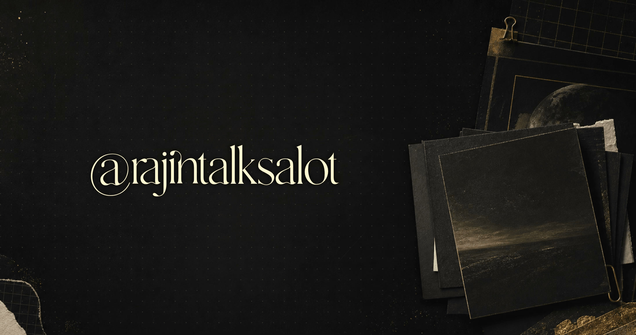
The project is mostly about restraint. I wanted the interface to feel quiet, dark, and deliberate, with the images doing most of the talking. Small details like the metadata placement, post transitions, stack spacing, and reading layout mattered because the site needed to feel like the posts, not just contain them.
The UX goal was to make browsing feel tactile without making it noisy. Hover states, scroll behavior, and page transitions are there to add rhythm, but they stay behind the content.
The Card Stack Problem
The hardest part was getting the stacked cards to feel natural. On desktop, the hover animation had to expand the images enough to feel physical without making the grid jump. On touch devices, hover does not really exist, so the interaction needed a different rhythm.
I ended up treating touch as a two-step interaction: first tap reveals the stack animation, second tap opens the post. That sounds simple, but making it work across pointer types, responsive viewports, and real mobile browsers took a lot of small fixes.
Responsiveness
A lot of the polish went into making the same idea work across screen sizes. The archive needed to feel spacious on desktop, but still make sense on narrow mobile screens where the cards, captions, and touch states have much less room.
The final version keeps the visual-first feeling while adjusting the spacing, stack size, and interaction model for smaller viewports. It is still the same archive, just tuned so it does not fall apart when the screen gets tight.
Tech Stack
-
Astro
Static pages and simple content-driven structure.
-
Vanilla CSS
Custom layout, responsiveness, and card stack motion.
Final Thought
This is not meant to be a platform or a heavy CMS. It is a small, carefully built home for a specific kind of post: visual, reflective, slightly dramatic, and better experienced as a sequence than as a feed.